


Dive into the Frankenstein vs. Dracula ink comparison with today’s reader-requested ink swatching showdown! You won’t regret it. These two gothic-inspired inks from Wearingeul’s World Literature Collection go head-to-head with moody tones, haunting sheens, and dramatic flair. Whether you’re a fan of literary legends, unique fountain pen inks, or just in the market for something dark and bold, this comparison has something for every ink lover.
Meet the Ink Maker: Wearingeul
Wearingeul is a South Korean ink brand renowned for its literary inspiration and artistic flair. Their World Literature ink series transforms timeless classics into rich, expressive fountain pen inks that are as imaginative as the works they honor. With every new release, Wearingeul proves its devotion to the story behind the shade.
Get to Know the Ink Series: World Literature Collection

The World Literature Ink series is one of Wearingeul’s most beloved collections. Each ink in the series draws inspiration from a particular book, scene, or character, and it shows. The colors are emotional. The formulas often feature special effects, such as sheen or shimmer. And the names? Iconic. This week, we’re shining a spotlight on two gothic masterpieces: Frankenstein and Dracula.
This Week’s Featured Inks: Frankenstein vs Dracula Ink Comparison

This side-by-side Frankenstein vs Dracula ink comparison was inspired by a customer request. These two moody, dramatic inks from Wearingeul’s World Literature series make a perfect duo, both in the literary canon and on the page. Let’s swatch them on Col-o-ring ink testing cards and take a closer look.
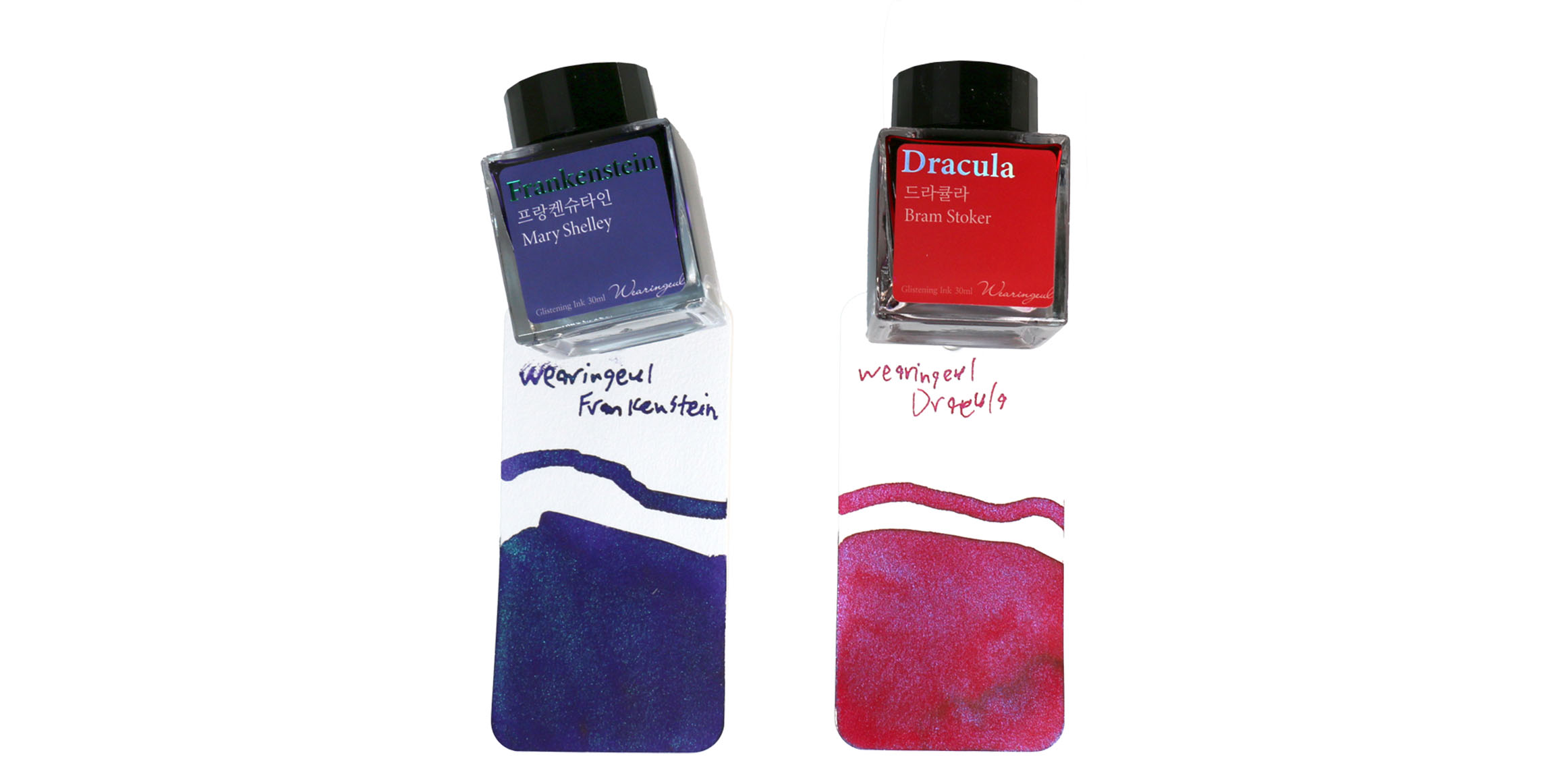
Today’s Inks: Frankenstein vs Dracula Ink Comparison
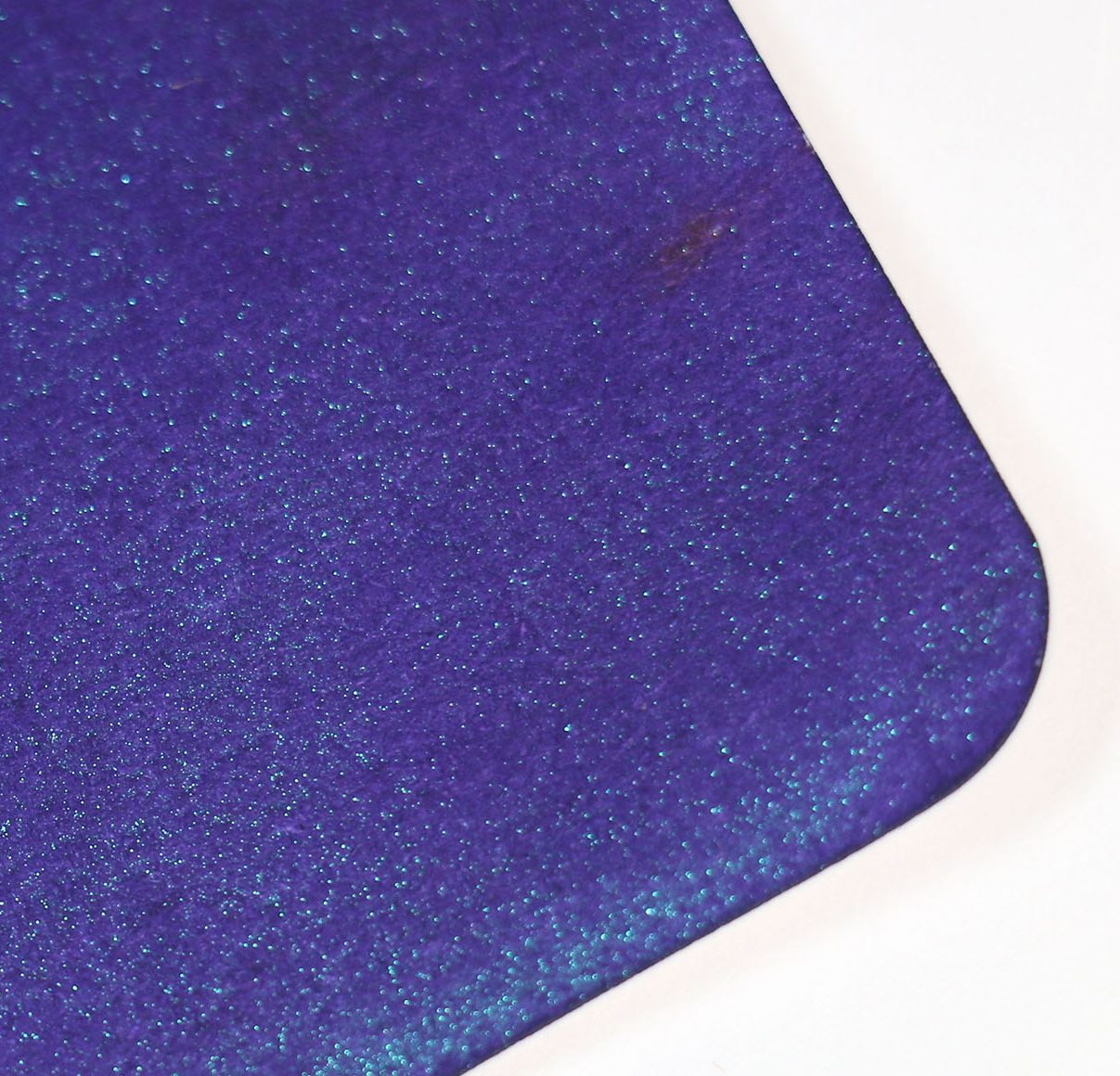
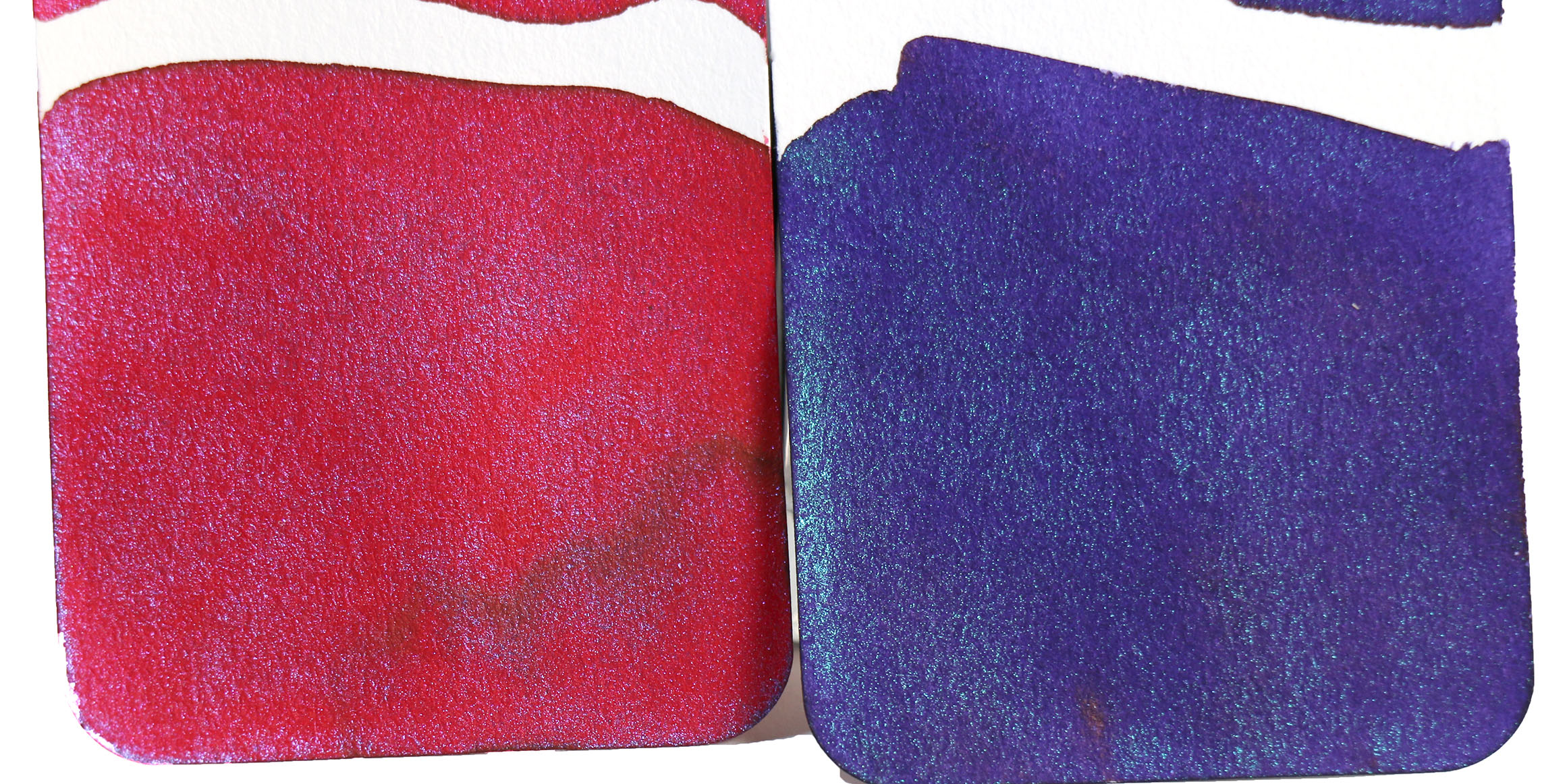
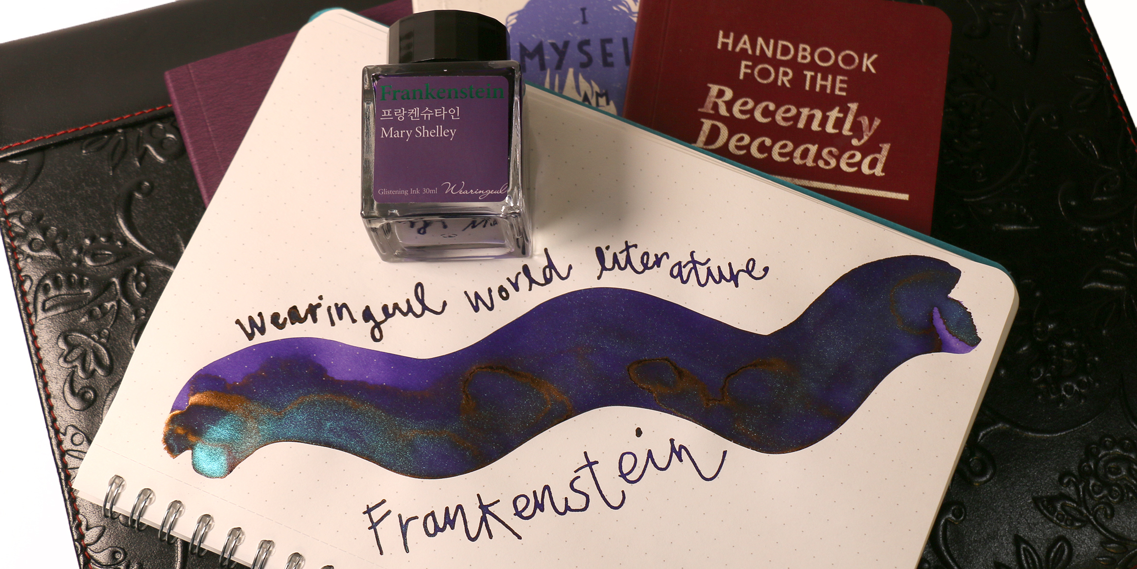
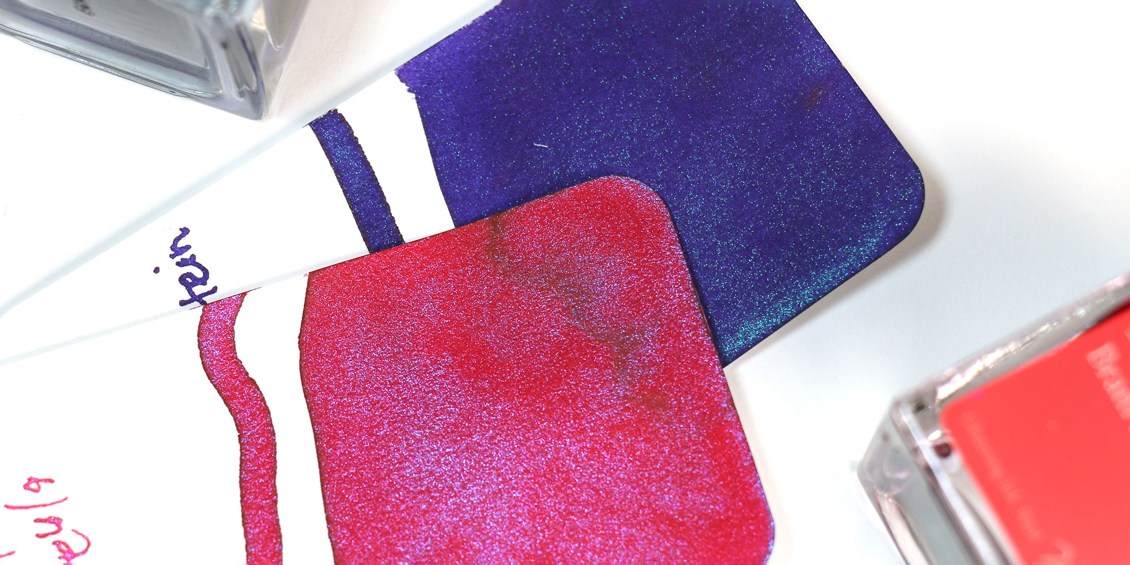
Frankenstein ink is a rich, dark purple with minor shading and a pearly blue shimmer that creates the illusion of murky green where it pools. On the page, you find yourself somewhere between twilight and midnight—moody, complex, and strangely electric. In some uses, you might also notice a minor copper sheen that adds some depth to this mysteriously stunning ink.
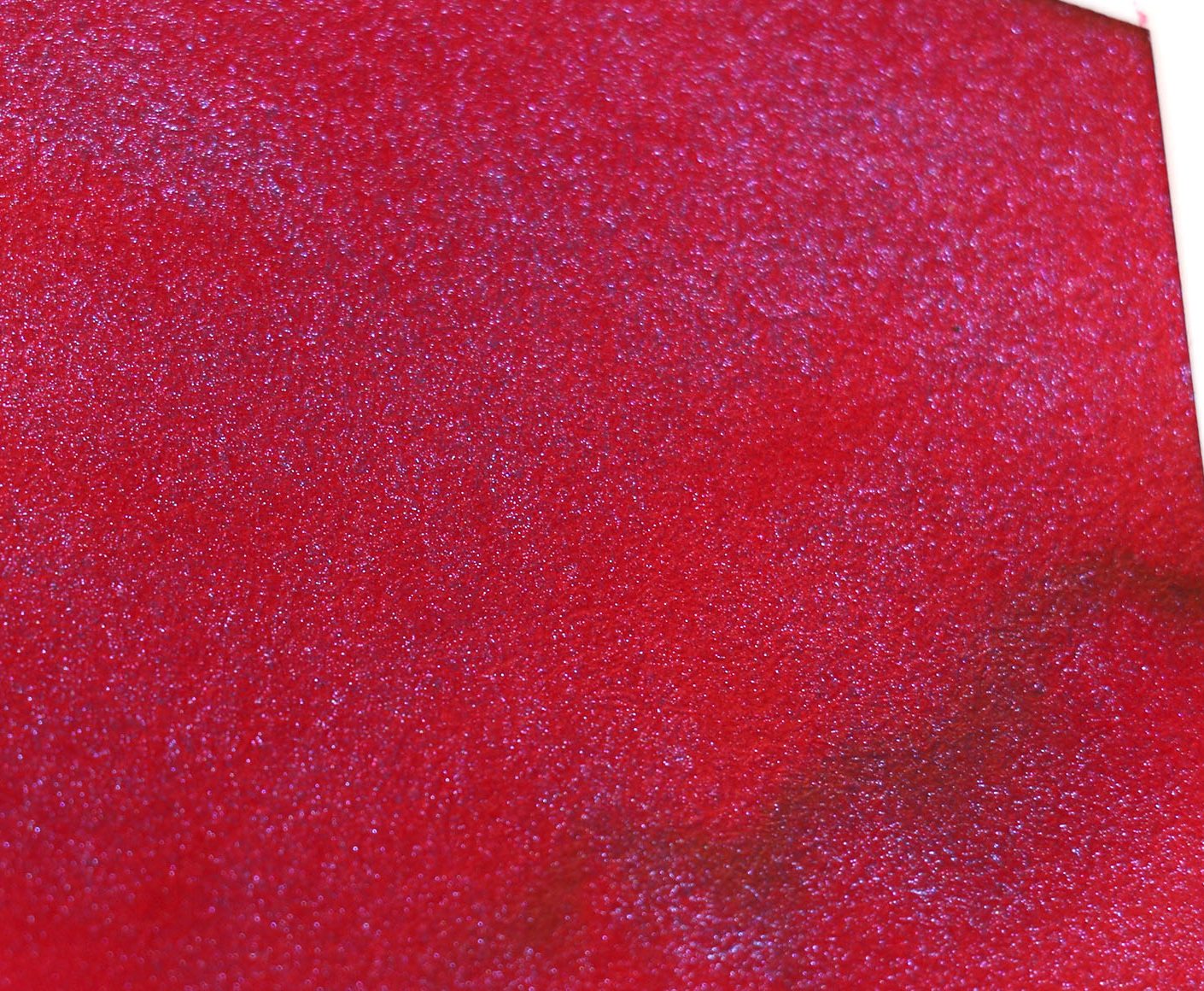
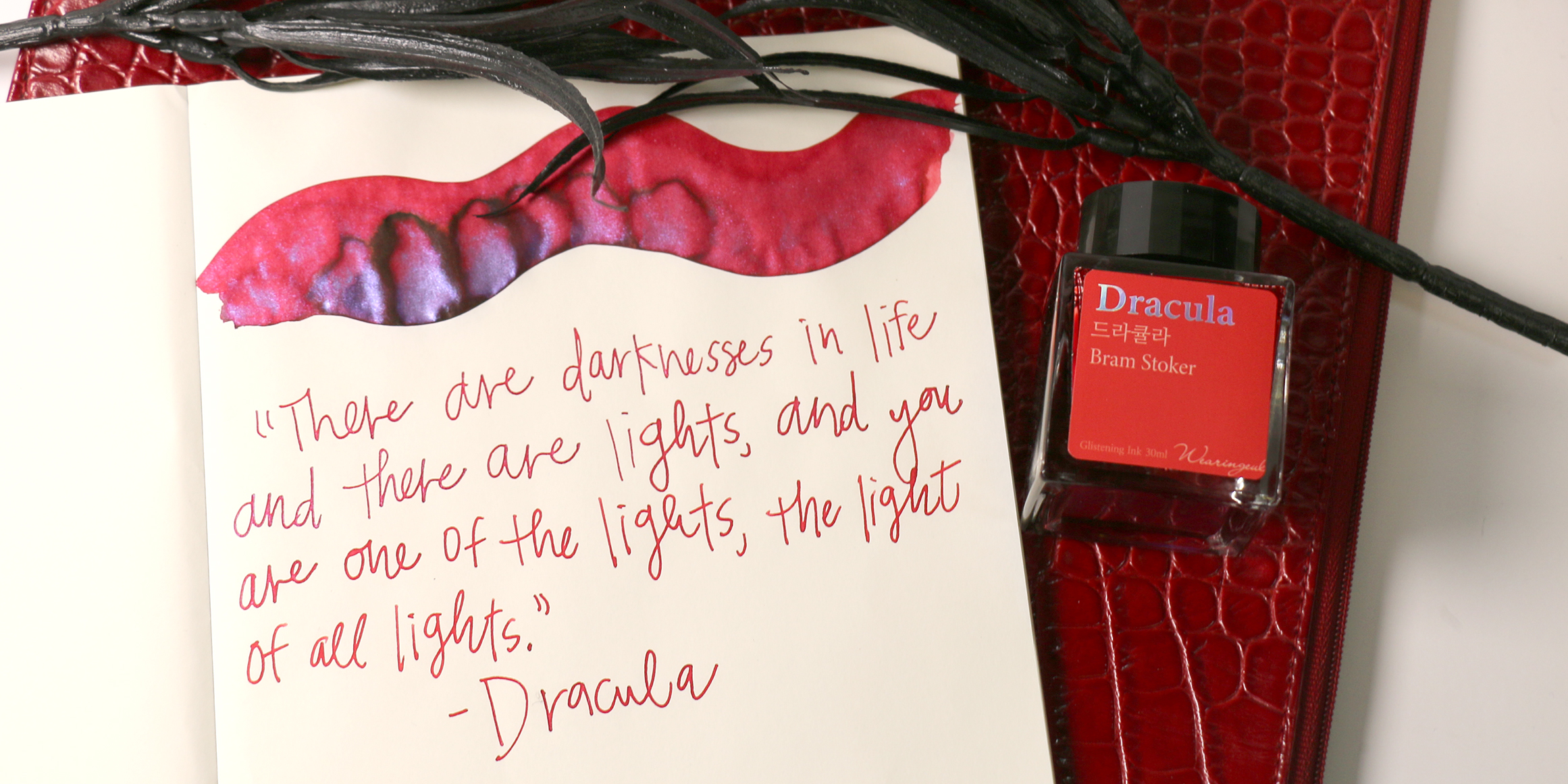
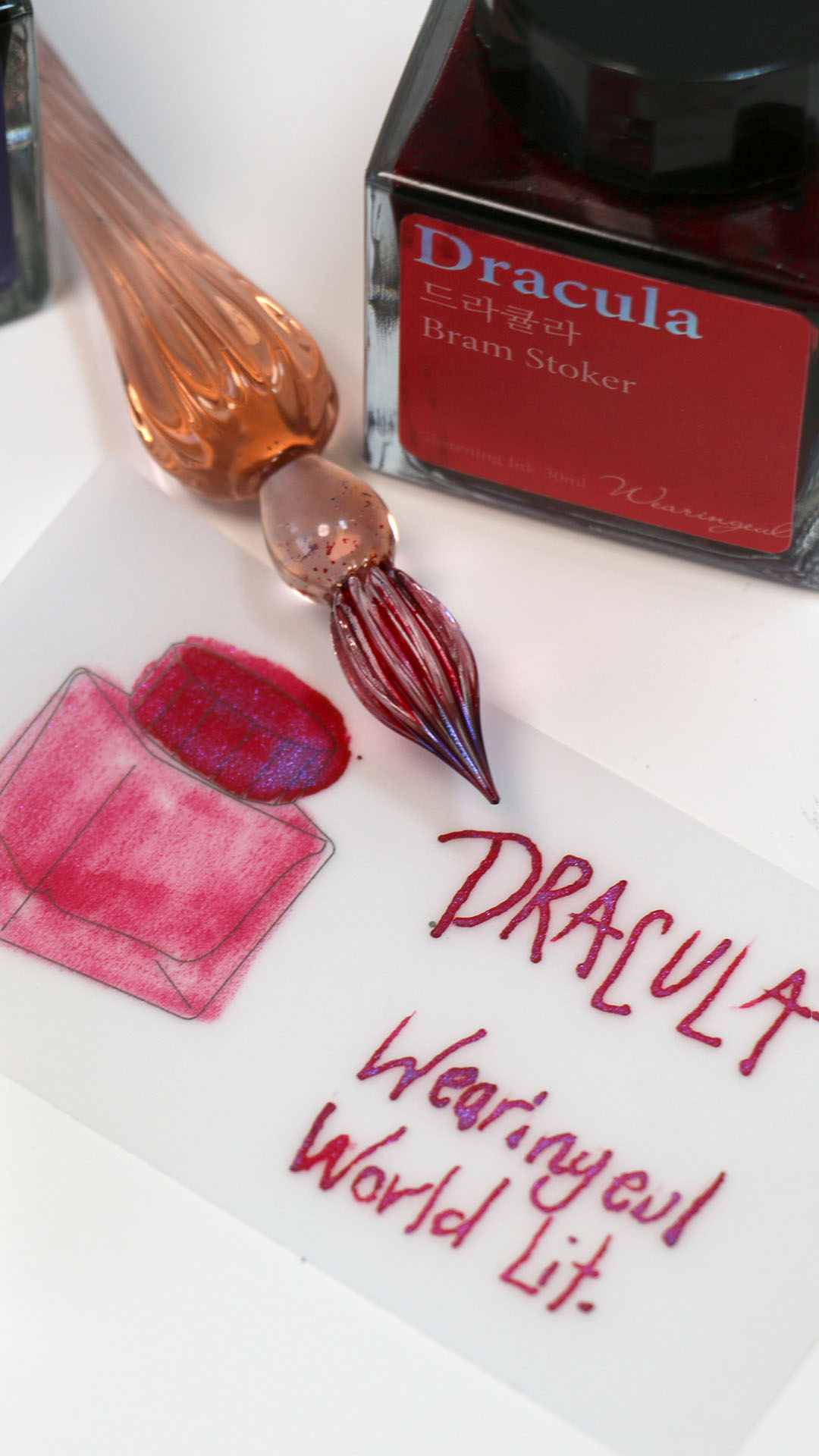
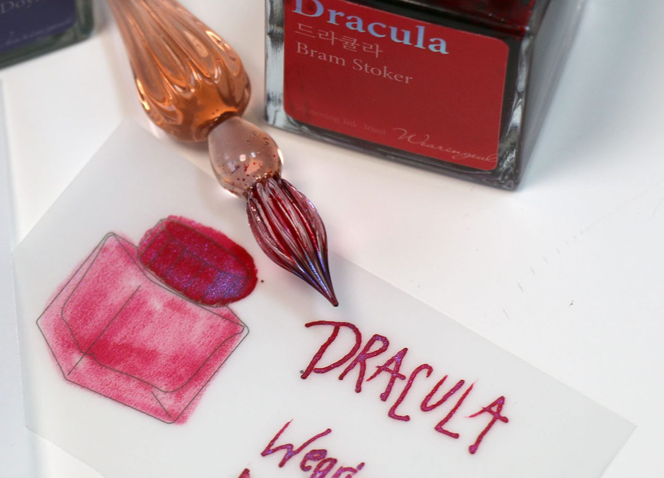
Dracula ink, on the other hand, lives up to its vampiric name. It’s a deep, blood-red crimson that comes off velvety and features a blue shimmer that glistens through the dark red. Inspired by Bram Stoker’s Dracula, this ink fits the vampire red theme. You almost expect it to disappear at sunrise.
Wearingeul World Literature Series Ink Bottle and Packaging
Both inks arrive in Wearingeul’s signature square 30ml bottles, featuring minimalist black caps and classic packaging that clearly and concisely displays all the necessary details. The ink bottles are made of glass and are easily accessible for inking. The square shape makes them easy to store and easy to use, with a solid base and an opening wide enough for any fountain pen or dip pen.
Other Products Used During Our Frankenstein vs Dracula Ink Comparison
- J. Herbin spiral glass dip pen
- Col-o-ring ink swatch cards
- Dee Charles Pen Wipe Wallet
- Wearingeul Tracing Ink Swatch Papers
- Rhodia notebook
- Wearingeul notebook
SIDE NOTE ON FOUNTAIN PEN FRIENDLY PAPERS AND OUR CURRENT FAVORITES: In today’s ink comparison, you not only get to get a look at a couple of our favorite Wearingeul World Literature fountain pen inks, but you also get to get a peek at how they perform on a few different papers (including both Rhodia and Wearingeul brand papers). Here’s a rundown of fountain pen-friendly papers we depend on heavily.
- We typically use Rhodia paper when performing our standard ink tests.
- We love how Clairefontaine shows off shimmer and sheen.
- Wearingeul’s notebooks were an addition to the inventory we still can’t stop talking about.
- Ink Swatch CARDS – need I say more? We adore all the ink swatch cards. Whether you’re a classic Col-o-ring fan with the simple metal ring clasp, a Dominant Industry ink swatch paper fan (we can barely keep these on the shelves), or a Wearingeul ink swatch card obsessor (the tracing cards, the special cards that bring up Cheshire Cat smiles and ink drops, etc. amid your swatch like magic) there’s too much fun to be had in this area.
- We’re currently embracing Wearingeul’s Jaquere Clear Chart Book, which allows us to gather all the ink swatch cards we need from various directions and easily keep them in one place. ( love) Thanks Wearingeul.
Wondering About Dry Time: How Fast Did the Inks Dry?
If you’re curious for more information about how these two inks perform, you can check out the full Wearingeul Frankenstein ink review and the full Wearingeul Dracula ink review. However, to appease your monstrous impatience…
- Frankenstein: approximately 10 seconds (impressive for all this heavy shimmer).
- Dracula: about 10 seconds (not bad for such a VIVID red ink).
Both inks are on the slower side, which is typical for sheening/shimmering inks with high saturation. For our standard water test results and 1-Dip Tests, check out the full fountain pen ink reviews linked above! (But it’s safe to summarize…these two do not like water.)
What About Their Special Properties?
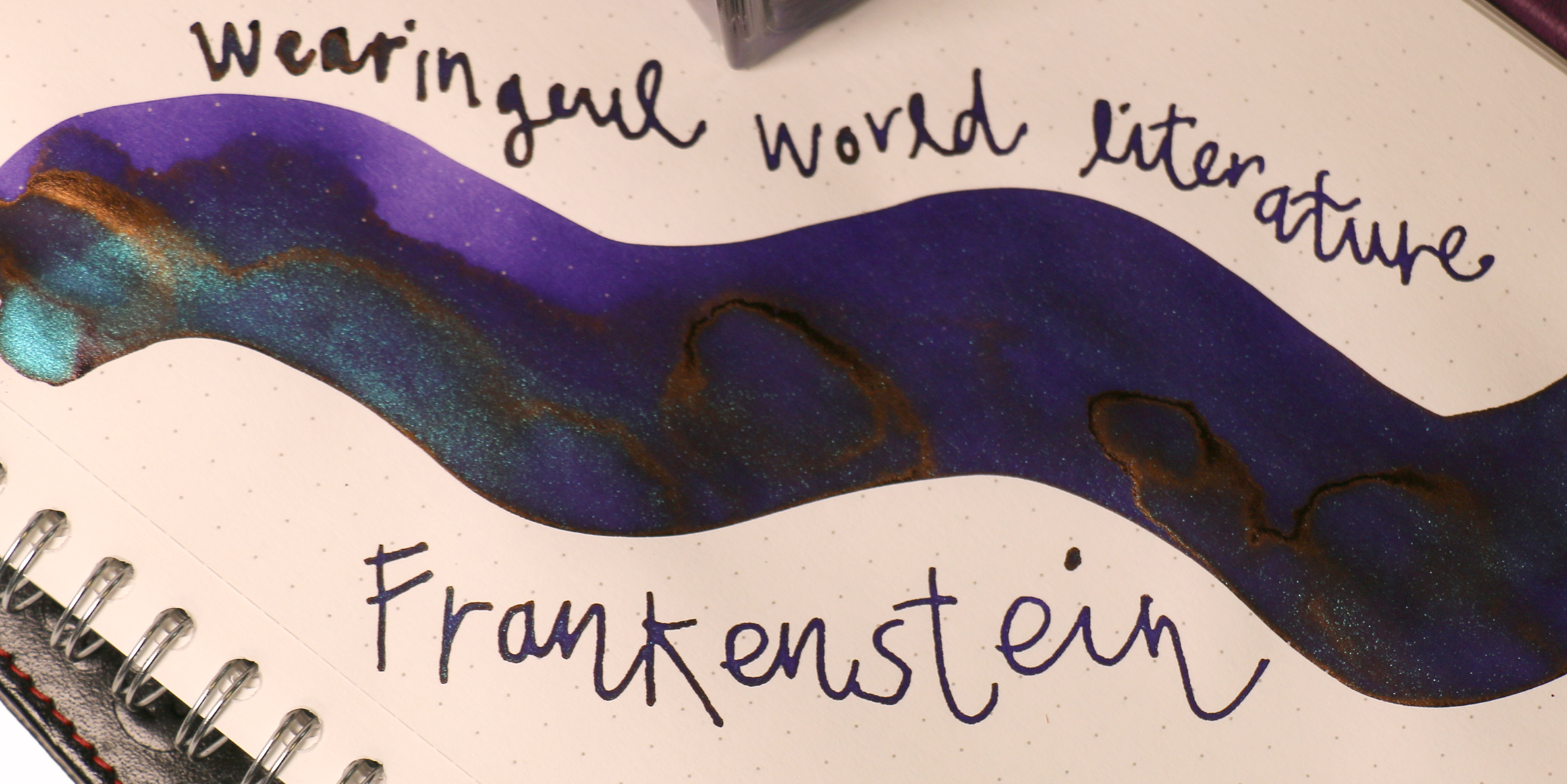
- Frankenstein ink: This purple ink has oomph, and that oomph is decorated with a heavy shimmer in purple and green. And you can’t dismiss the sheen. We’ve seen others describe it as a “rust-like copper sheen,” but for us, it appears more like a green sheen leaning towards turquoise or aqua. The fountain pen ink fits its namesake perfectly.
- Dracula ink: Dramatic shimmer that can look more purple than blue combined with the deep crimson red ink, Dracula also seems to show some shading potential (but not a lot). However, the deep crimson ink has a DEFINITE blue shimmer that you can see in swatches AND writing.
These are high-drama inks with personalities that leap right off the page to come at you. You might even say they’re coming to get you.
Frankenstein vs Dracula Ink Comparison Conclusion:
If you’re drawn to moody, mysterious inks that tell a story, you’ll love both of these Wearingeul World Literature selections. Frankenstein offers a complex, almost existential green with hidden depths, much like Mary Shelley’s tale. Dracula, meanwhile, is a rich, seductive red with an icy cool sheen that practically begs to be written with under candlelight, in the middle of the night, to tap into the dark romance and intrigue inspired by the classic literature.
Whether you’re journaling under thunderclouds or writing with the curtain drawn tight, these two literary inks won’t disappoint.
FAQ: Frankenstein vs. Dracula Ink Comparison
Q: Are Wearingeul inks safe for all fountain pens?
A: Yes, both Frankenstein and Dracula are designed for use with fountain pens. However, due to their shimmering properties, we recommend cleaning your fountain pen after each use. We also suggest using a larger nib size (e.g., Broad, Stub, BB, Flex, etc.). Or, of course, they love a good dip pen.
Q: Which ink is better for daily writing?
A: Frankenstein may be slightly better suited for daily use based solely on its color; it has a more neutral tone. Dracula’s deep red, plus blue shimmer, makes it ideal for special projects or headers.
Q: Is there shimmer in either ink?
A: Yes! You’ll enjoy the shimmer in these two—it’s a powerful addition to these already BIG ink colors.
Q: Where can I find more inks like these?
A: Check out other inks in the Wearingeul World Literature collection at PenChalet.com.
Buy Fountain Pens
Buy Fountain Pens
Buy Mechanical Pencil Refills
Pen Brands:
Delta Pen
Montegrappa Fountain Pens
Waterman Pen Company
Fisher Space Pen .375 Caliber Cartridge Ballpoint Pens
Noodlers Konrad Brush Fountain Pens
Taccia Covenant
Country of Origin:
American Pen Brands
Italian Pen Brands
Austrian Pens
