



Some purple inks whisper. Monteverde Charoite does not. In this Monteverde Charoite ink review, we’re looking at a saturated dark violet with a pronounced blue cast—a true “blurple” that feels colorful and expressive while staying dark enough for readable everyday writing.
Our test revealed a wet-writing ink with a surprisingly quick dry time, excellent behavior on Rhodia paper, and much better water resistance than we expected. And because an ink this good-looking deserves an equally good-looking home, we’re pairing Charoite with four fountain pens, from an accessible everyday option to a 50-piece limited-edition stunner.
Meet the Ink Maker: Monteverde USA
Monteverde USA has been creating writing instruments since 1999, with a particular emphasis on color, approachable luxury, and products designed for everyday use. Fountain pen fans may also know the company for its extensive ink selection: Monteverde says its lineup now includes more than 180 fountain pen inks.
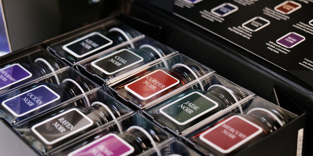
Monteverde’s Noir Ink Collection explores darker, moodier fountain pen ink colors across a wide range of hues.
One distinguishing feature of Monteverde fountain pen ink is the company’s ITF, or Ink Treatment Formula. According to Monteverde, ITF is designed to improve ink flow, extend cap-off time, and help lubricate and protect a fountain pen’s feeding system against corrosion and clogging.
That emphasis on flow certainly fits what we experienced with this week’s ink.
Get to Know the Monteverde Gemstone Ink Series
Charoite is part of the Monteverde Gemstone Ink Collection, a fountain pen ink series inspired by the colors and visual character of gemstones. Current colors in the Monteverde Gemstone collection include shades such as Tanzanite, Sapphire, Moonstone, Olivine, Malachite, Topaz, Ruby, Fireopal, Garnet, Amethyst, and Charoite.
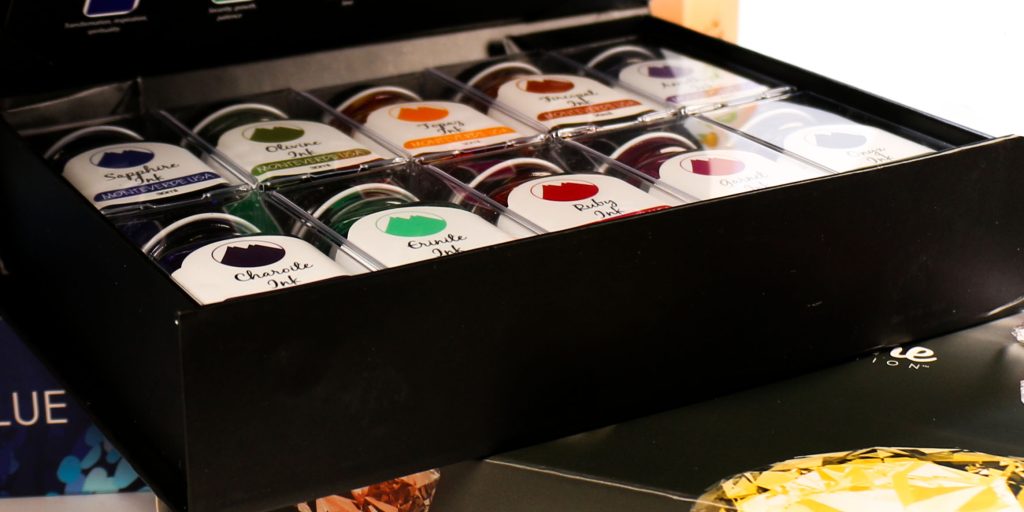
It’s a fitting home for Charoite. Natural charoite is a stone known for its striking violet coloring, and Monteverde’s interpretation lands firmly in the violet family, but not in the soft lavender or traditional royal-purple zone.
This one leans blue.
Monteverde currently offers Charoite in both 30ml and 90ml bottled ink formats.
This Week’s Featured Ink: Monteverde Charoite
So, what does Monteverde Charoite fountain pen ink actually look like on paper?
Based on our test, we’d describe it as a deep, saturated violet with a strong blue cast. Fountain pen people have a wonderfully efficient word for colors like this: blurple.
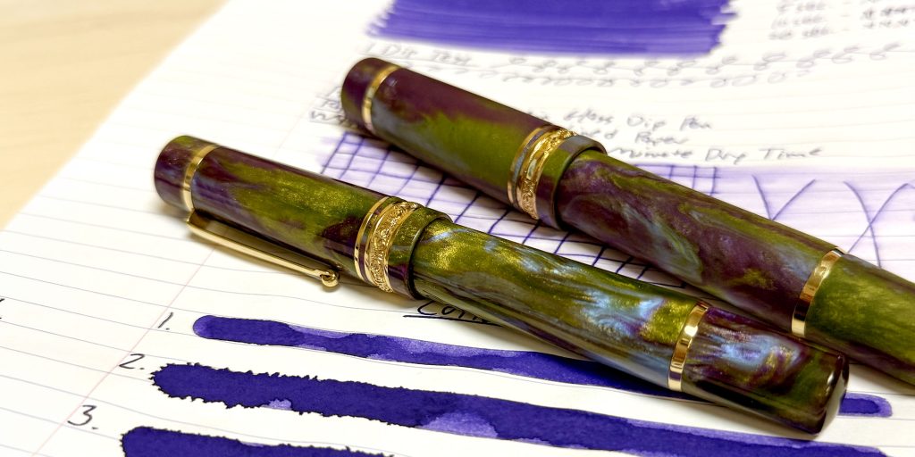
The Delta DV Wisteria Walk fountain pens create a rich green-and-violet pairing with Monteverde Charoite ink.
In normal writing, the blue influence is immediately noticeable. At first glance, particularly in a finer or wetter line, you could almost mistake Charoite for an unusually vivid dark blue. Look again, though, and the purple becomes unmistakable.
The cotton swab portions of our ink test made that violet character even clearer. Where we deposited more ink across the paper, Charoite revealed a richer purple tone while retaining its cool blue undertone.
The result is an ink with enough saturation and depth to be highly legible without sacrificing personality. If standard blue feels a little too predictable but bright purple feels inappropriate for everyday writing, Charoite occupies an attractive space between the two.
Monteverde Charoite Ink Review Test Results
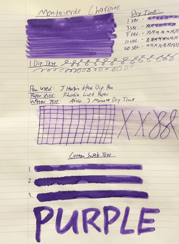
The complete Monteverde Charoite ink test includes color swatches, dry time, one-dip writing, water resistance, and cotton swab results.
For this ink review, we tested Monteverde Charoite using:
J. Herbin glass dip pen: The glass dip pen produces a line comparable to approximately a medium fountain pen nib.
Rhodia lined paper: As always, keep in mind that fountain pen ink can perform differently depending on nib size, pen flow, paper, and even environmental conditions. Our results represent what happened with this specific combination.
Ink Bottle and Packaging
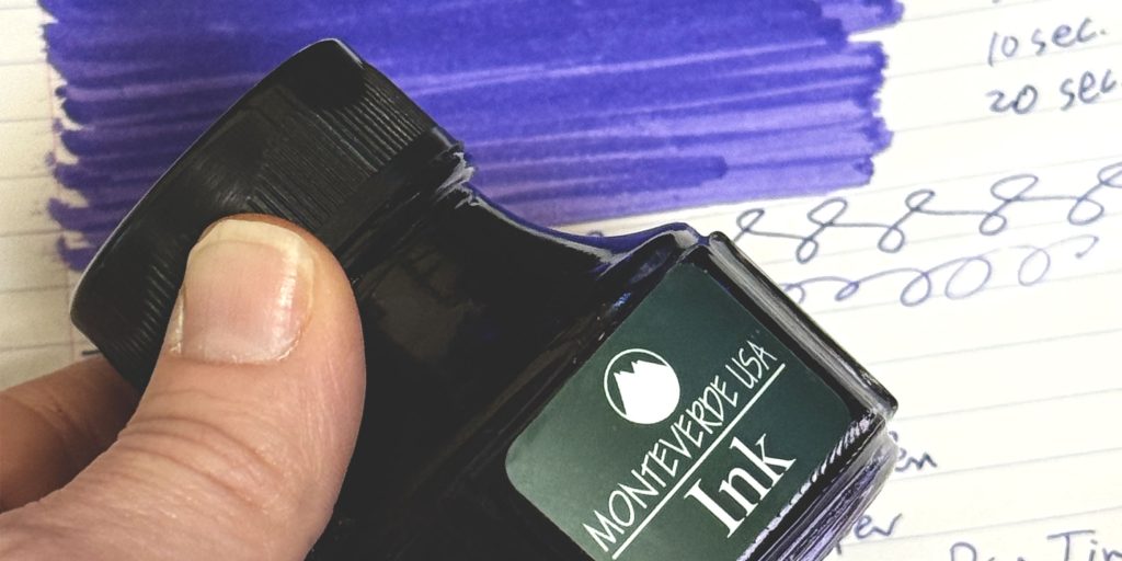
Monteverde’s Charoite bottle gets points for practicality.
The bottle sits inside a cube-shaped outer package that keeps it secure while staying easy to open and access.
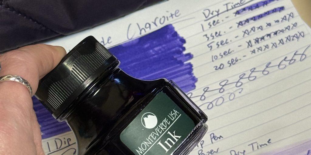
A close look at the sturdy Monteverde Charoite 90ml fountain pen ink bottle.
Once removed, the ink bottle itself has a wide, round base with a substantial bottom, giving it a sturdy stance on the desk. That’s not the most glamorous ink characteristic until you’ve nearly knocked over an open bottle of fountain pen ink…at which point stability suddenly becomes extremely glamorous.
The broad base noticeably reduces the likelihood of tipping, while the large bottle opening makes it easy to access the ink with a fountain pen nib or other filling tool.
For frequent inkers, both features are genuinely useful.
Other Products Used During the Monteverde Charoite Ink Review
Our test setup was intentionally simple:
- J. Herbin glass dip pen
- Rhodia lined paper
- Monteverde Charoite fountain pen ink
Rhodia also gives us a relatively ink-friendly paper surface for evaluating feathering, bleed-through, dry time, and color presentation.
1-Dip Test
With a single dip, the J. Herbin glass dip pen produced approximately one and a half lines of writing before needing more ink.
That’s a relatively short run, particularly considering how wet Charoite felt while writing.
However, dip-test longevity isn’t a direct measurement of fountain pen flow. It can also depend heavily on how much ink the glass nib’s grooves capture during the initial dip.
What was much more noticeable during the test was Charoite’s generous flow on the page.
Monteverde Charoite Ink Review Dry Time
Despite behaving like a fairly wet ink, Monteverde Charoite dried in approximately 10–15 seconds during our Rhodia paper test.
That’s a nice result.
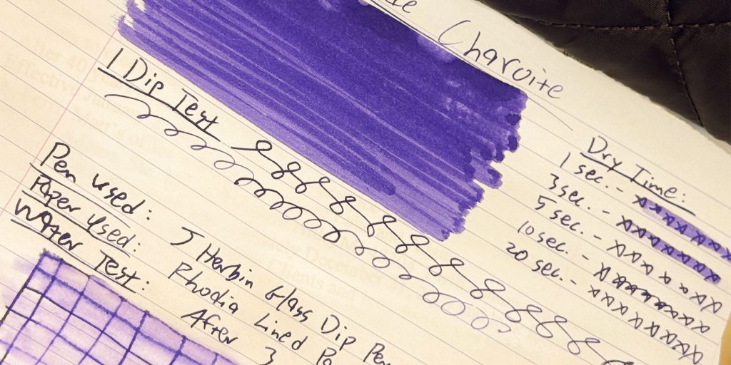
Monteverde Charoite showed an approximately 10–15 second dry time during our Rhodia paper test.
Wet inks can provide a particularly smooth, saturated writing experience, but that extra flow sometimes comes with long drying times. Charoite gave us much of the visual richness we’d expect from a wetter ink without forcing us to wait around forever before touching the page.
Of course, dry time can change considerably depending on your nib and paper. A broad or stub nib that deposits more ink may take longer to dry than a fine nib.
Still, our approximately 10–15 second result makes Charoite a very usable everyday option.
Water Test: How Did Charoite Handle Water?
This may have been the most surprising part of the test.
Monteverde Charoite is not waterproof. The ink visibly ran when exposed to water, so we would not classify it as a water-resistant ink intended for archival or permanent document applications.
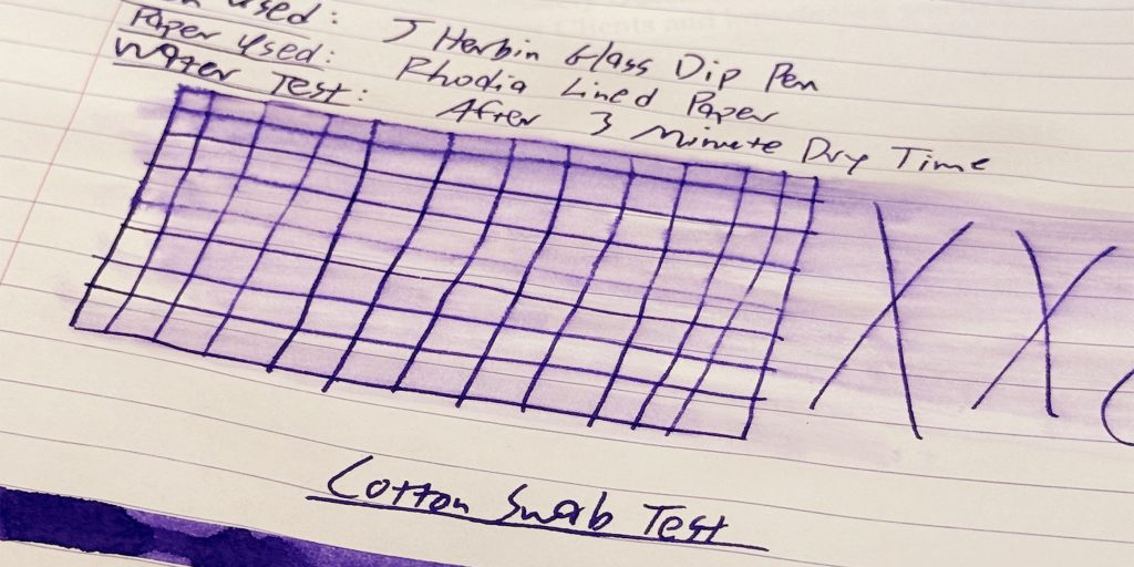
Charoite showed some running after water exposure, but the original lines remained surprisingly visible and readable.
But the original writing held up remarkably well.
After water exposure, we noticed:
- Visible ink running
- Very slight distortion of the original lines
- Slight feathering around some affected areas
- No bleed-through on the Rhodia paper
- Original writing that remained clearly visible and highly legible
In other words: Charoite moved, but it didn’t disappear.
If you accidentally splash a journal page or get a few drops of water on handwritten notes, our test suggests you’ll still be able to read what you wrote.
That’s much stronger real-world survivability than we see from some standard fountain pen inks.
Special Properties: Shading, Sheen or Shimmer?
We did not observe obvious shimmer or dramatic sheen during this test.
Charoite’s visual appeal comes primarily from its rich blue-violet color and saturation rather than special-effect particles or heavy surface sheen.
Some tonal variation appears where the ink amount changes. In heavier applications, particularly our cotton swab tests, the purple character becomes more obvious. Thinner written areas tend to emphasize Charoite’s cooler blue side.
A close look at the sturdy Monteverde Charoite 90ml fountain pen ink bottle.
That shift is one reason the ink is interesting even without shimmer.
It’s not trying to sparkle.
It’s letting the color do the work.
Feathering or Bleeding
On Rhodia paper, Monteverde Charoite behaved exceptionally well during normal writing.
We observed:
No feathering.
No bleed-through.
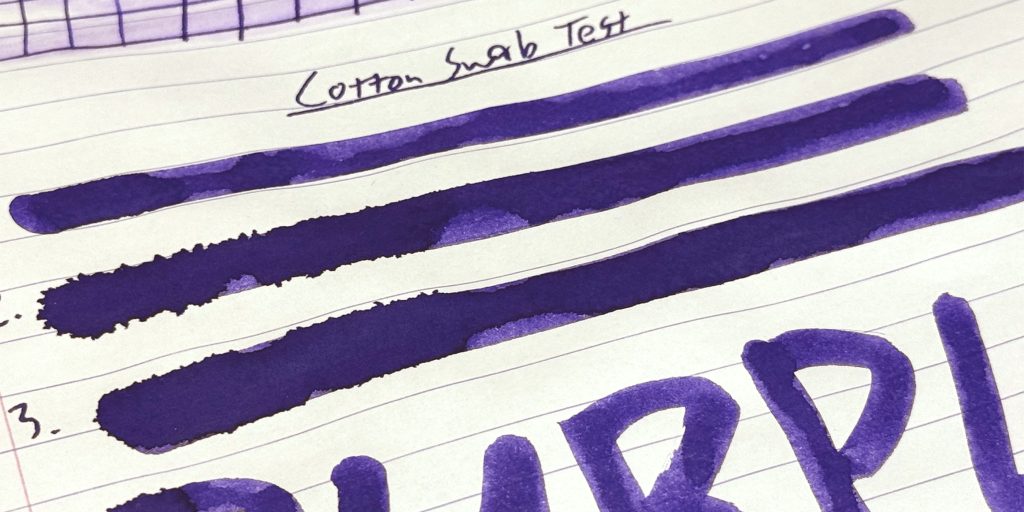
That’s especially nice considering the ink’s wet flow and dark saturation. The lines remained clean and controlled during our standard writing test.
Very slight feathering did appear after the water test, but it occurred because we introduced water rather than during normal ink performance. The only other time we noticed any feathering was when using the ink with extremely heavy applications.
Perfect Pen Pairings for Monteverde Charoite
An excellent ink deserves the right pen—and Charoite gave us several very different ways to build a beautiful pairing.
Instead of choosing four purple pens and calling it a day, we selected each for a different reason.
The Perfect Pairing: Delta DV Oversize Wisteria Walk
This one wasn’t much of a contest.
The Delta DV Oversize Wisteria Walk fountain pen pairs beautifully with Monteverde Charoite because the pen’s resin incorporates violet, green, and subtle blue tones that capture the ink’s complexity without trying to duplicate it exactly.
The Delta DV Wisteria Walk fountain pens create a rich green-and-violet pairing with Monteverde Charoite ink.
Placed beside our actual Charoite test, the relationship is especially striking. The ink draws out the cooler violet and blue tones running through the resin, while the green areas provide enough contrast to prevent the combination from becoming monochromatic.
The Oversize Wisteria Walk also features a matte finish, giving the swirling resin a softer, almost stone-like appearance that feels particularly appropriate alongside an ink inspired by a gemstone.
Add its #8 gold-plated stainless steel nib, yellow-gold trim, and production limited to just 50 pieces, and you have a collector-worthy dream pairing for Charoite.
There is also a shiny Midsize Wisteria Walk version, limited to 88 pieces and fitted with a #6 gold-plated stainless steel nib, for writers who prefer a smaller format.
The Tonal Everyday Pairing: Monteverde Axis Matte Purple
Want to keep the pairing in the Monteverde family?
The Monteverde Axis Matte Purple fountain pen makes a wonderfully clean match.
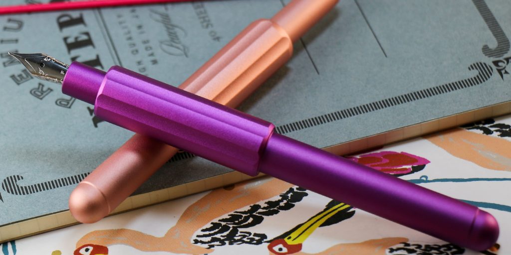
The Monteverde Axis Matte Purple fountain pen creates a clean, tonal pairing with Monteverde Charoite’s saturated blue-violet ink.
Its vivid matte purple exterior echoes Charoite’s violet personality while its simple, contemporary design keeps the attention on the writing experience.
There’s also something satisfying about matching a Monteverde fountain pen with a Monteverde Gemstone ink—particularly when the colors cooperate this well.
Compared with our collector-level Delta pairing, the Axis gives Charoite a much more approachable everyday home.
The Dream Pairing: Delta Four Rings Misteria
Then there’s the option that has apparently decided subtlety is somebody else’s problem.
The Delta Four Rings Misteria fountain pen combines deep green material with a transparent violet center and gold trim. Visually, it picks up many of the same color relationships that make Wisteria Walk work so well with Charoite, but turns the drama all the way up.
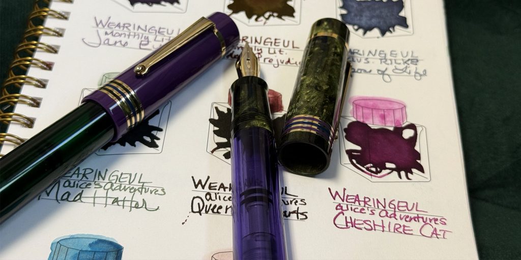
The Delta Four Rings Misteria fountain pen brings deep violet, green, and gold together for a dramatic pairing with Monteverde Charoite ink.
The violet section creates an obvious connection to the ink while the green provides complementary contrast.
This is the luxury fantasy pairing: distinctive pen, saturated ink, gorgeous color story.
If you’re the kind of collector who believes your fountain pen and ink pairing should feel like an event, Misteria understood the assignment.
The Contrast Pairing: Pilot Custom 74 Lavender Fog
Not every successful pairing needs to match.
The Pilot Custom 74 Lavender Fog fountain pen works because it gives Charoite room to be the dramatic one.
Lavender Fog’s exceptionally pale, cool lavender body sits at almost the opposite end of the saturation spectrum from Charoite. Put the two together, and you get a sophisticated light-to-dark progression: misty lavender pen, saturated violet-blue ink.
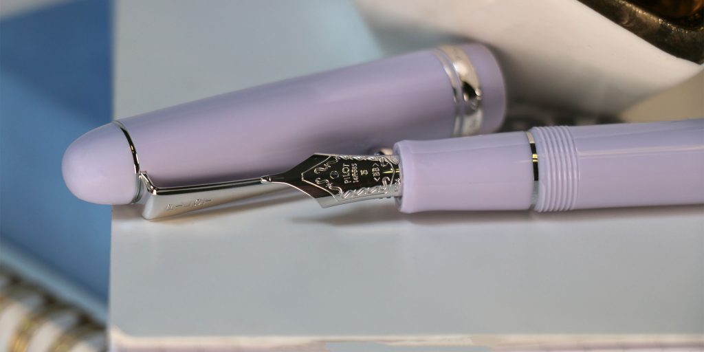
The Pilot Custom 74 Lavender Fog fountain pen offers a soft, pale-lavender contrast to Monteverde Charoite’s deep blue-violet ink.
It’s an especially appealing combination for someone who loves purple but doesn’t necessarily want the pen itself to be bold.
The softness of Lavender Fog makes Charoite look even richer.
Final Thoughts: Is Monteverde Charoite Worth Trying?
Absolutely—especially if your favorite inks live somewhere between blue and purple.
Monteverde Charoite gives you a dark, saturated blurple that’s visually distinctive without becoming difficult to read. It has enough blue in the mix to feel surprisingly practical, while its unmistakable violet character keeps it far more interesting than a conventional blue ink.
Our test also delivered several strong performance results.
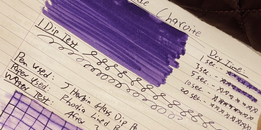
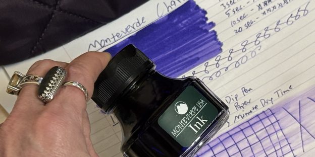
Monteverde Charoite ink shown beside the handwritten dry time and one-dip test results.
The ink wrote wet and smoothly, dried in approximately 10–15 seconds, and produced no feathering or bleed-through on Rhodia paper.
Its water-test performance was an unexpected bonus. Charoite certainly isn’t waterproof, and some of the dye ran after water exposure, but the original lines remained impressively intact and readable.
Add Monteverde’s practical, stable bottle design and easy-access opening, and Charoite becomes more than simply a good-looking purple ink.
It’s an easy ink to imagine actually using.
For notes. For journaling. For letters. For signatures. For the days when blue seems too predictable and purple seems exactly right.
And, naturally, for filling one spectacular Wisteria Walk fountain pen.
FAQ: Monteverde Charoite Ink Review
Is Monteverde Charoite blue or purple?
Monteverde Charoite is best described as a dark violet with a strong blue cast. Fountain pen users often call this type of color “blurple.” In normal writing, the blue influence is noticeable, while heavier swatches reveal more of the ink’s purple character.
Is Monteverde Charoite a wet ink?
During our test, Charoite behaved like a wet-writing fountain pen ink with generous ink flow.
How quickly does Monteverde Charoite dry?
Our test on Rhodia paper produced an approximate dry time of 10–15 seconds using a J. Herbin glass dip pen that writes similarly to a medium nib.
Is Monteverde Charoite waterproof?
No. The ink ran when exposed to water. However, the original writing remained surprisingly legible, with only slight line distortion and feathering during our test.
Does Monteverde Charoite feather or bleed through paper?
We observed no feathering and no bleed-through on Rhodia paper during normal writing. Slight feathering occurred only after the ink was exposed to water.
Does Monteverde Charoite have shimmer or sheen?
We did not observe noticeable shimmer or dramatic sheen in our test. Its visual interest comes primarily from its saturated blue-violet color and tonal variation.
What pen pairs well with Monteverde Charoite?
Our favorite pairing is the Delta DV Oversize Wisteria Walk fountain pen, whose violet, green, and blue-toned resin complements Charoite beautifully. Other strong options include the Monteverde Axis Matte Purple, Delta Four Rings Misteria, and Pilot Custom 74 Lavender Fog.
What collection is Monteverde Charoite part of?
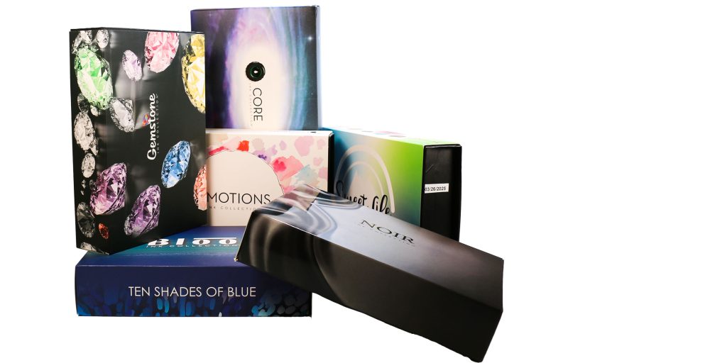
Monteverde offers several themed fountain pen ink collections, including Gemstone, Noir, Emotions, Sweet Life, and Ten Shades of Blue.
Charoite belongs to Monteverde’s Gemstone Ink Collection, a series of fountain pen inks inspired by the colors and character of gemstones.